Orbis Identity
Informed by Brad and Kendall’s circular approach and mission to leave the world a better place than they found it, we set out to create an identity that would launch Orbis into a competitive market—loudly, proudly and roundly!
The first step in developing the brand’s identity was to establish a name that would speak directly to its ethos. Orbis was a fitting choice, derived from the Latin term for circular motion.
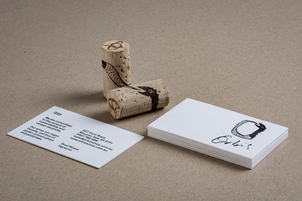
A logo was organically rendered by hand, emphasising the circular form of the letter ‘O’ and creating an additional brand asset.
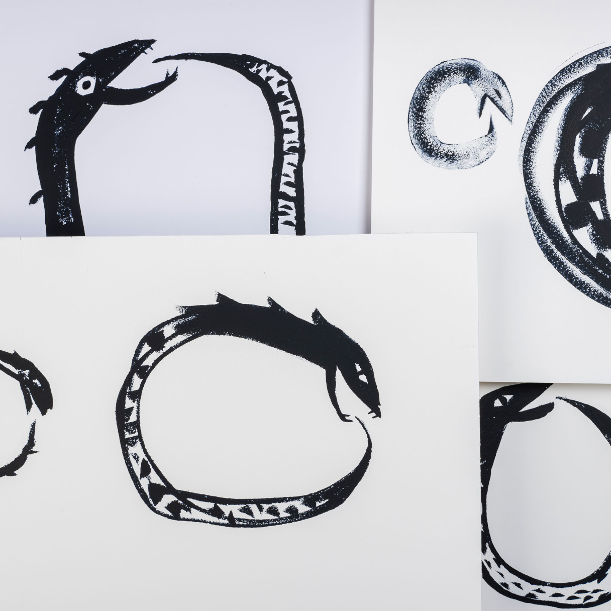
The name and logo were supported by a strong graphic device. A purpose-illustrated ouroboros—a mythical creature that eats its own tail—to further play on the eternal cycle of renewal and give visual strength to the brand.
Circular referencing was then extended to all brand outputs, from business cards to merchandise and everything in between.
Even the custom Shopify e-commerce website we created saw images move off one side of the page upon user scrolling, only to reemerge from the other as the user continued to scroll—accentuating Orbis’ circular philosophy.
Credits
—
Web Development: Anagraph
Illustration Commission: Dan Tomkins
