Skillogalee Identity
When tasked with creating a new identity for the long-standing and much-loved Skillogalee brand, many considerations had to be made.
Located in the heart of the Clare Valley, Skillogalee encompasses vineyards, a winery, a cellar door, a restaurant and accommodation. Yet, most importantly, it represents a sense of place, community and legacy—affectionately embraced by a loyal following of customers with a strong affinity for the long-standing brand!
So, in evolving the brand’s identity, our explicit instruction was, understandably, to contemporise it whilst ensuring it still felt like Skillogalee.
Naturally, our initial explorations centred around the existing Skillogalee logotype—a Gaelic calligraphic flourish. Whilst unique in the wine space and part of the brand for three decades, we quickly realised it would not give us the premiumisation the project demanded. But it also didn't feel right to create something brand new.
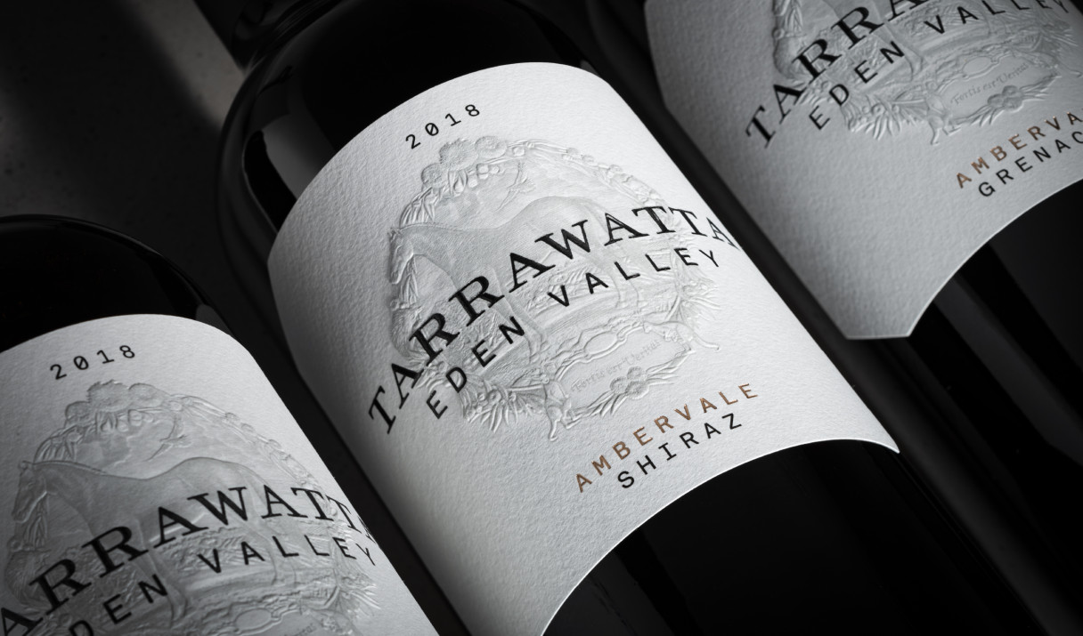
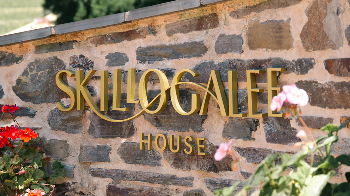
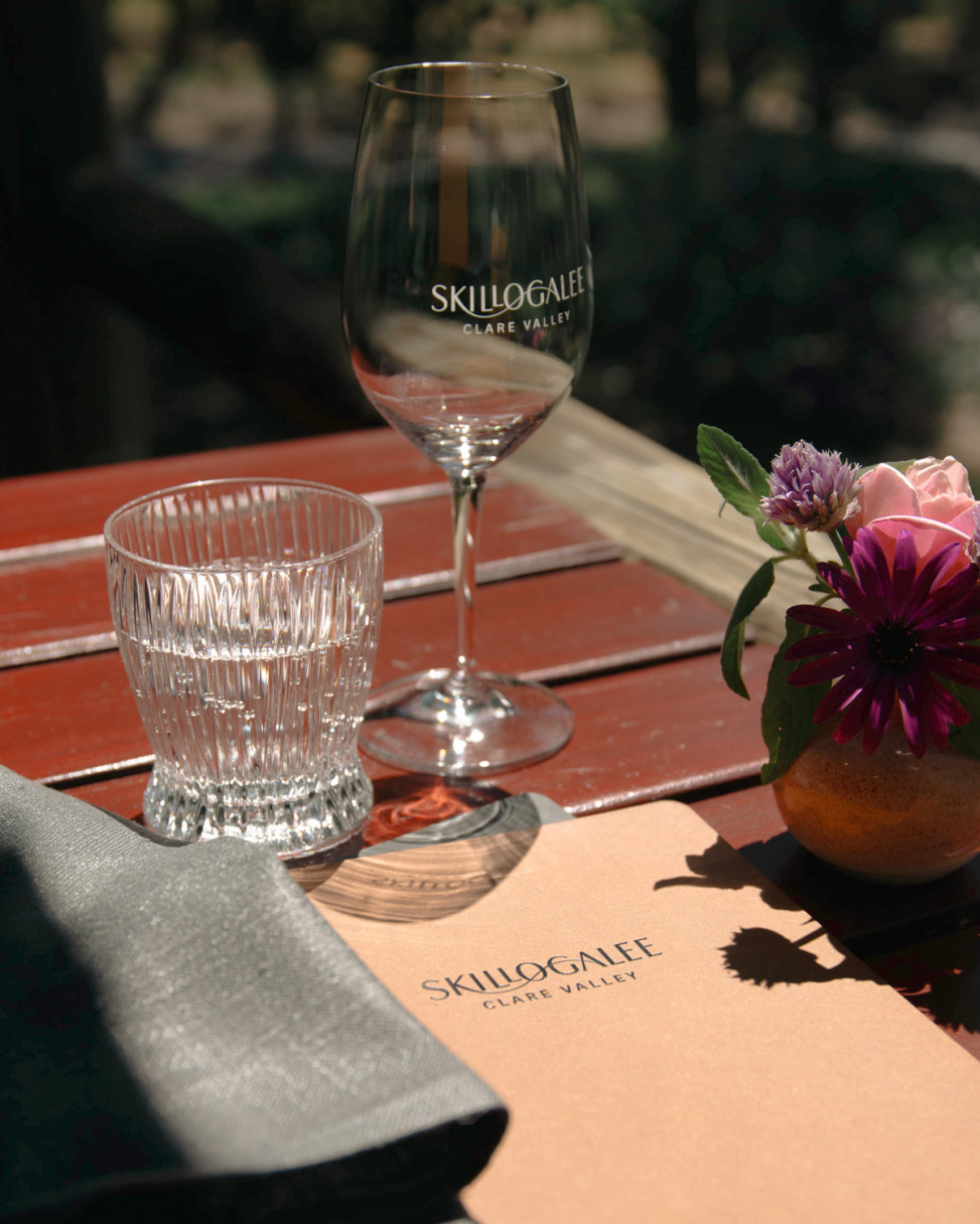
The solution was found in the original Skillogalee logotype from the 1970s—an elegant humanist sans-serif. The subtle swelling at each terminal suggests a serif, much like classical Roman capitals. Once recovered from the Skillogalee archives, the original logotype was redrawn to give it a refined and contemporary edge. The contours of Skillogalle’s vineyard were also drawn into the new mark, instilling further connection to place by linking the ligatures of the ‘k’ and ‘a’.
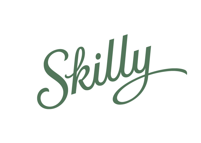
A separate handwritten logotype was crafted for the entry-level Skillogalee range, Skilly. This mark was made to feel like it belongs to the greater brand while retaining a slightly bolder, more approachable and energetic feel than the master logo.
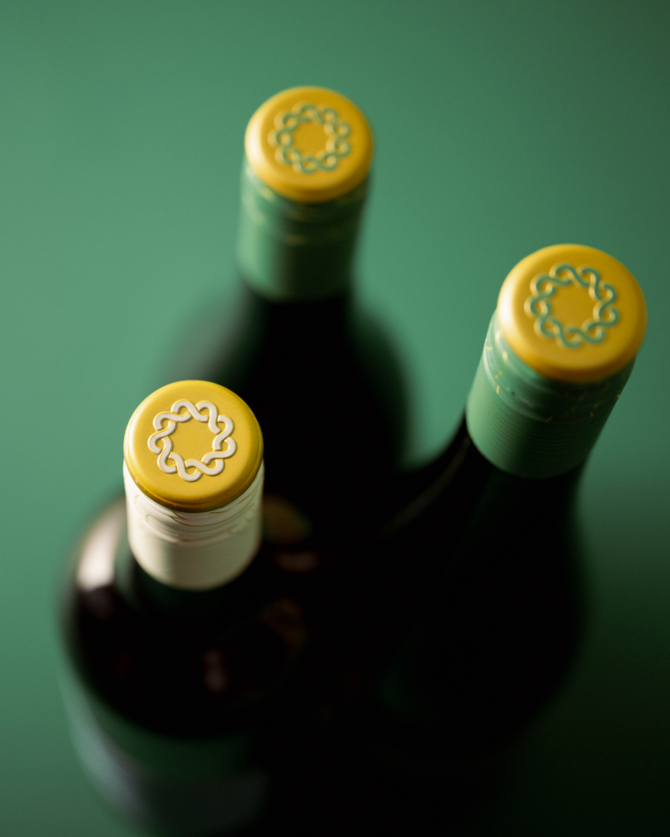
A roundel, created from the repeated letter S, was also incorporated into the identity suite. This new asset symbolises the brand’s positioning as the ‘heart of the Clare Valley’ and its ambition to be a focal point for the community.
But, if you’ve ever been lucky enough to visit Skillogalee and sit under the veranda, the detail that’s likely to stand out is the verdant green landscape before you. From the giant olive tree in the garden restaurant to the dense eucalypt forest surrounding it—there's a lot of green.
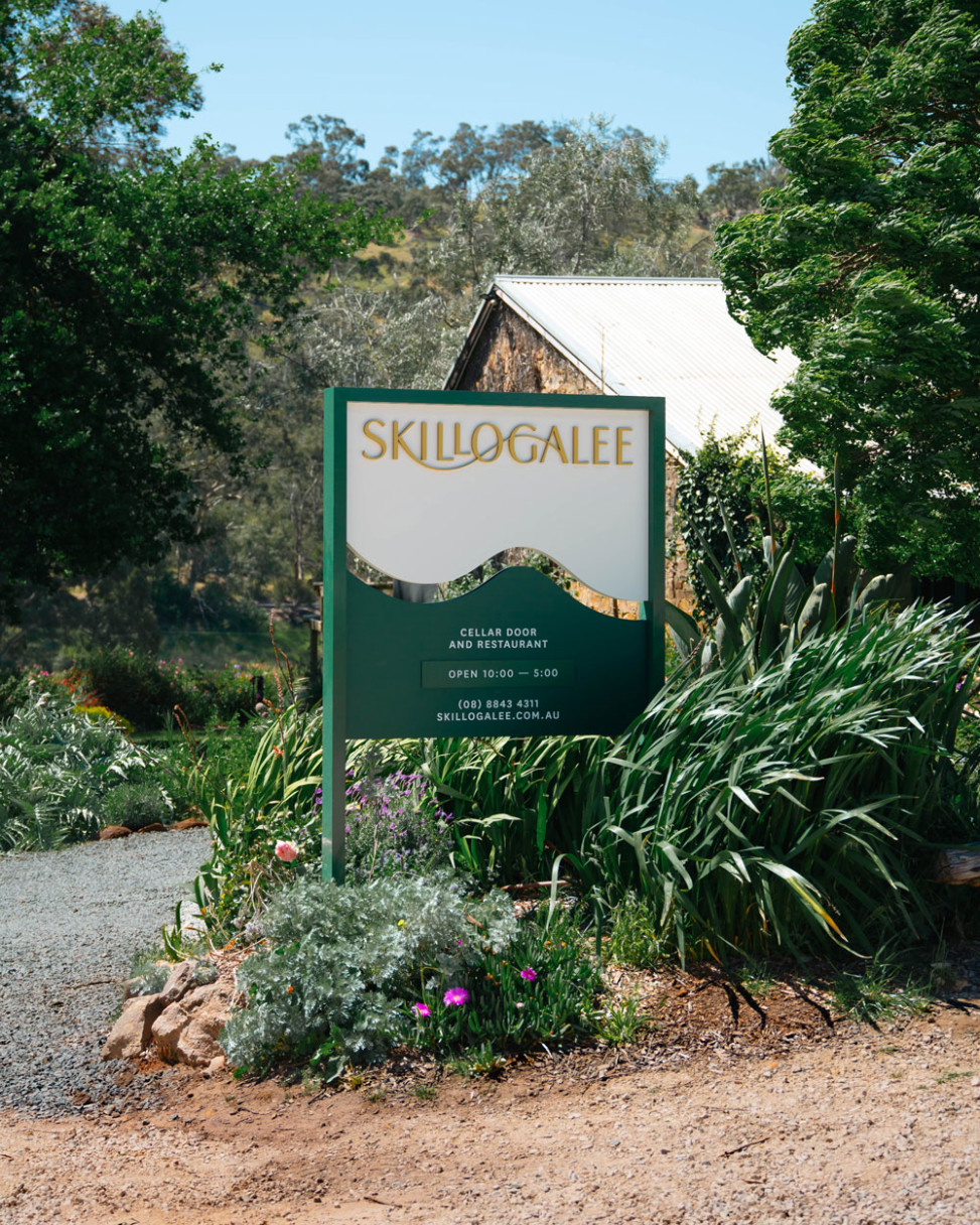
In selecting the brand’s primary colour, a rich green seemed like a natural fit. Paired with gold foil and cotton textures, this palette aesthetically exudes the visceral sensation that envelops you when standing on the site.