Lark Identity
In establishing Lark Distilling Co. in 1992, Bill Lark achieved a massive feat. Not only had he overthrown the antiquated laws that prohibited Australian spirit production, and created the first new Australian distillery in some 154 years. He also paved the way for the emergence of the Australian spirits industry as it is known today.


Before ↑
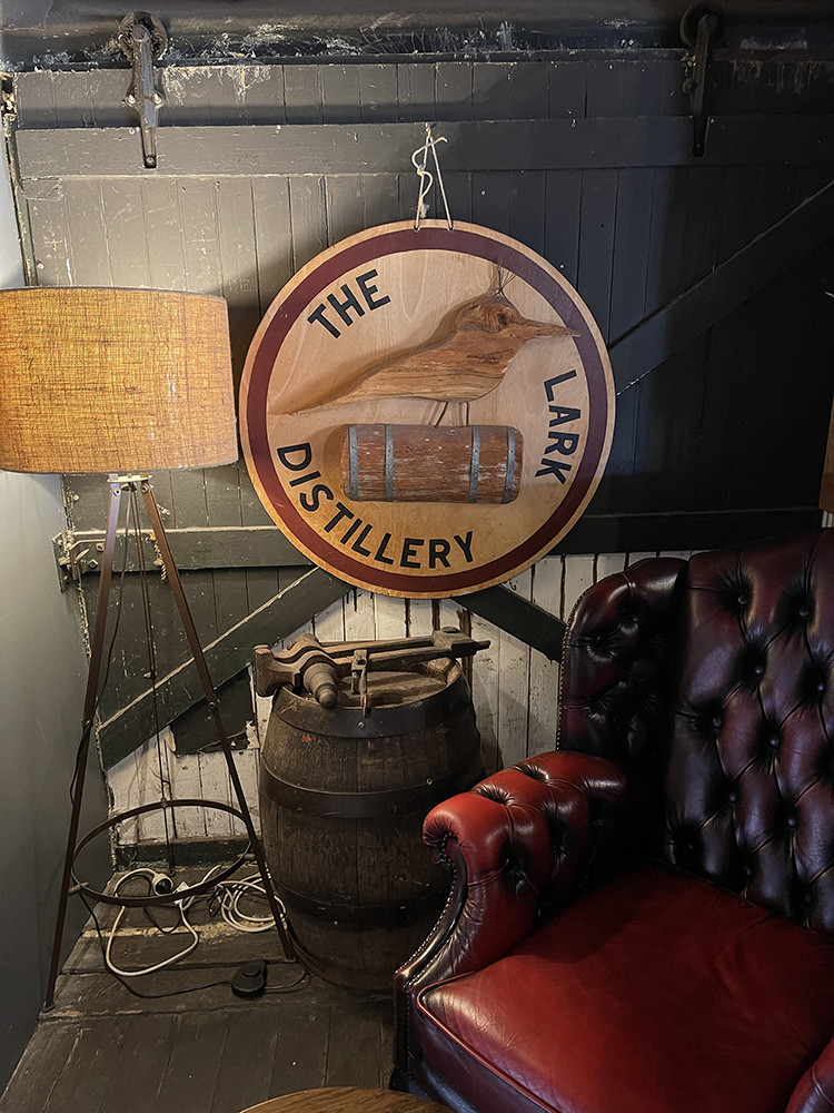
The original Lark identity epitomised precisely what it stated on bottle—meticulously crafted, expensive Tasmanian whisky. But it was also in the look adopted by the entire category—with traditional typography, scripted type, dark colours and lots of wood grain.
What the packaging didn't do was deliver on Lark’s unorthodoxy, innovation or courage. Lark needed to look like it was leading the category, not just content in being part of it.
Though we felt the existing brand symbol of a Lark was a perfect match for the business and one we were happy to inherit. We also felt that the way in which the Lark had been rendered was somewhat antiquated—viewing like an 18th-century engraving and including the traditional and overused category cue of a literal barrel on which the Lark was perched.
In redesigning the Lark trademark, we evolved the Lark symbol aiming for a more sophisticated, elegant and timeless depiction. One that would better suit the newly established brand positioning and aspirations and allow for a broader range of applications across materials—print, glass, metal, wood, etc.
The new symbol shows a Lark standing in water with its body facing left (in respect for traditions and heritage) with eyes to the right (focussing on the future). It incorporates only enough detail to elicit the form of the bird, with all extraneous detail (feathers, etc.) stripped for visual brevity, simplicity and maximum usability.
The full logo lockup pairs the Lark symbol with a semi-serif typeface to create a sophisticated and elegant trademark.
The new identity translates to animation with ease and includes the song of a Lark as an additional and ownable brand mnemonic.


Credits
—
Motion: Firme
→ Lark Strategy
→ Signature Collection Packaging
→ Rare Cask Packaging
→ Legacy Packaging


