Dr George Balalis Identity
After developing a strategy for Dr George Balalis that was centred around his passion for transforming patient lives, we set about creating an identity that spoke directly to his purpose.
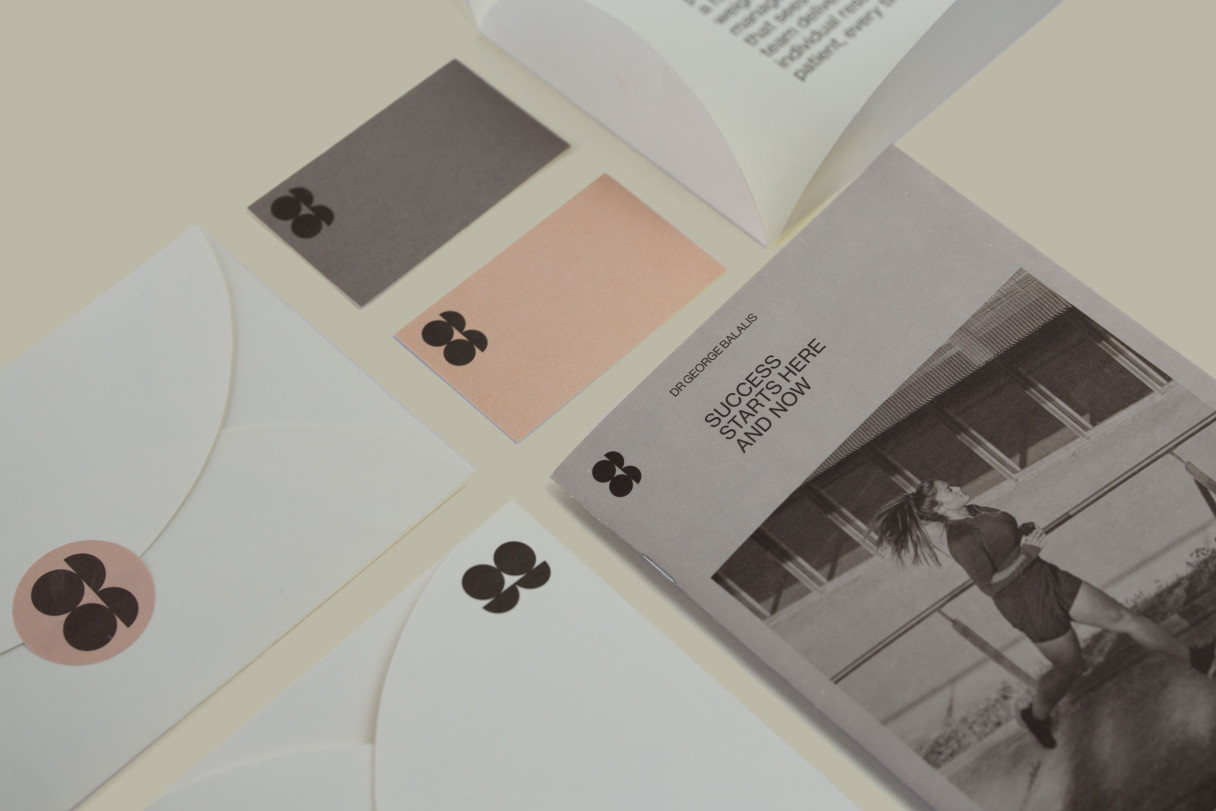

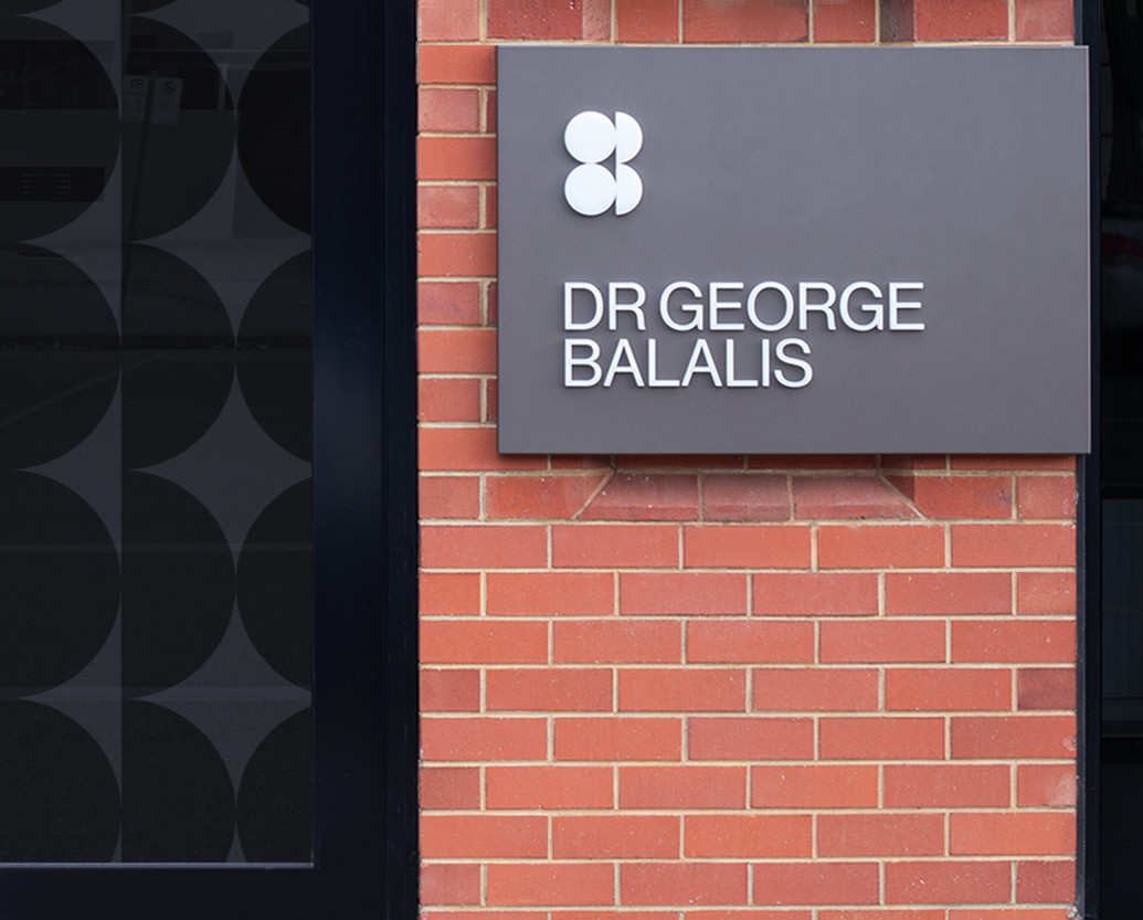
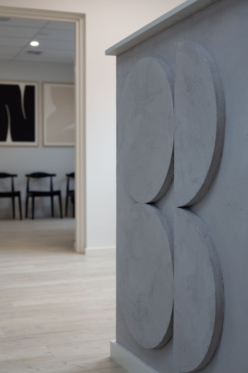
The logo is the key visual device within the new identity. It was created by abstracting geometric versions of the letterforms G and B (for George Balalis). Thus, resulting in a visual depiction of weight loss—with the B being half the size of the G.
The logo is supported by minimalist typographic selections and precise use of grids and layouts to instil the level of professionalism and exacting standards you’d expect of a surgeon. The colour palette and use of tactile materials then adds a human element to the brand.
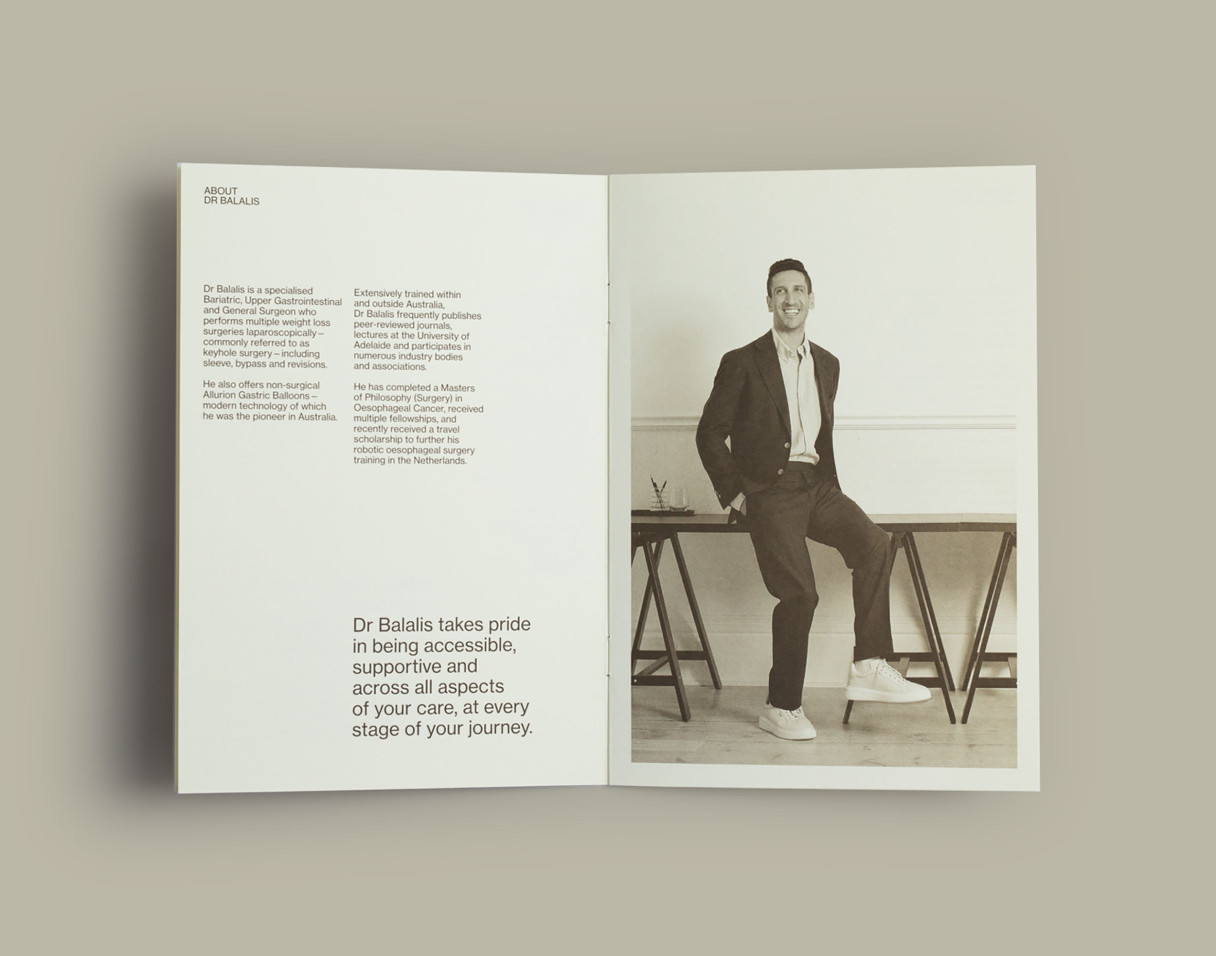
Tone of voice was also critical in the development of the identity. All copy speaks directly to patients with clarity, confidence and the same level of empathy and warmth you encounter when you meet Dr Balalis in person.
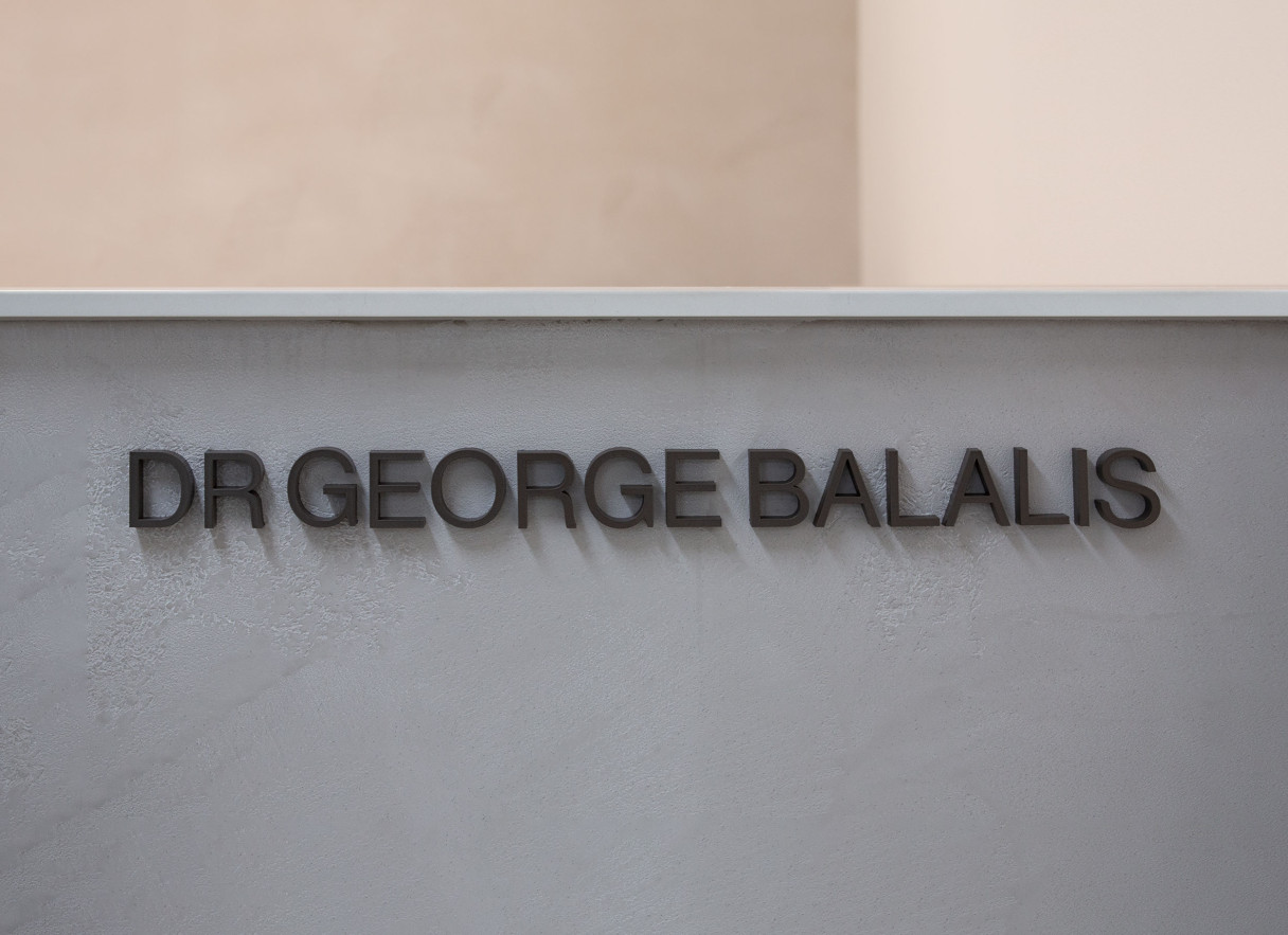
Stationery, brochures, a patient welcome pack, internal and external signage, photography, social media templates, social content and a website re-skin were all developed within the identity.
Credits
—
Signage: Signs of the Time
Portrait Photography: Alice Healy
→ Dr George Balalis Strategy
→ Dr George Balalis Launch Campaign