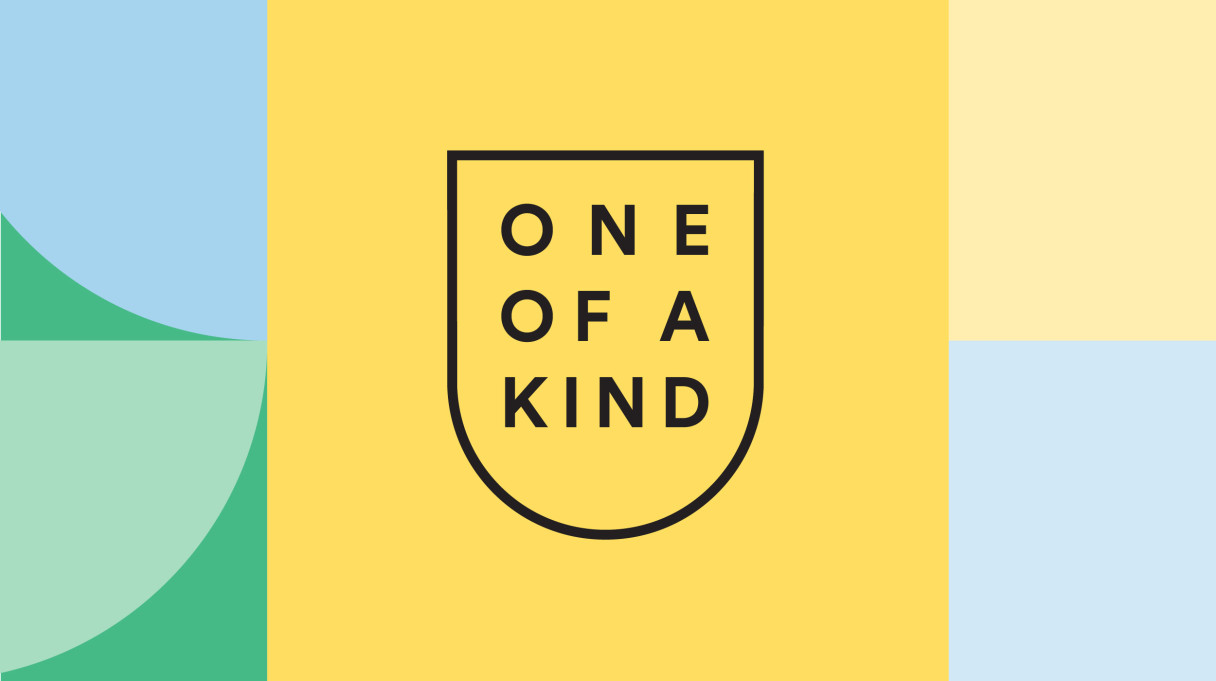
SpaceCraft Identity
The SpaceCraft brand has grown, adapted and evolved over the course of our relationship with the company—spanning an impressive 15 years. But the values that SpaceCraft embody and that we convey through all touchpoints of their identity remain—quality, detail, understated elegance, craftmanship and eclecticism.
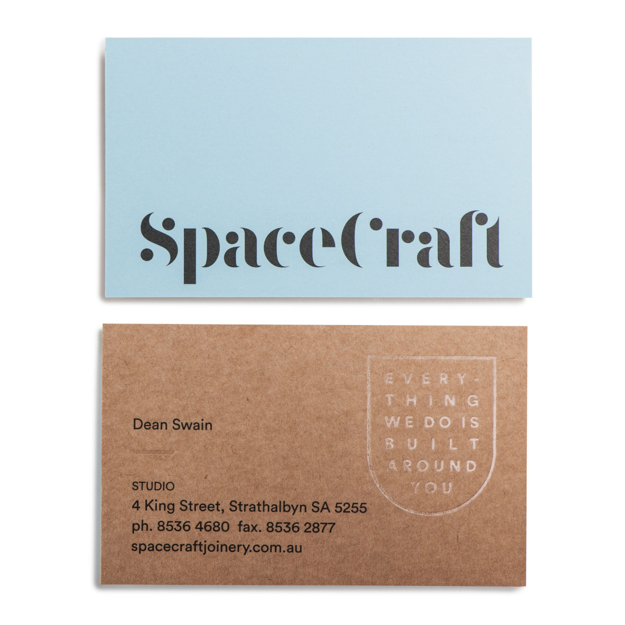
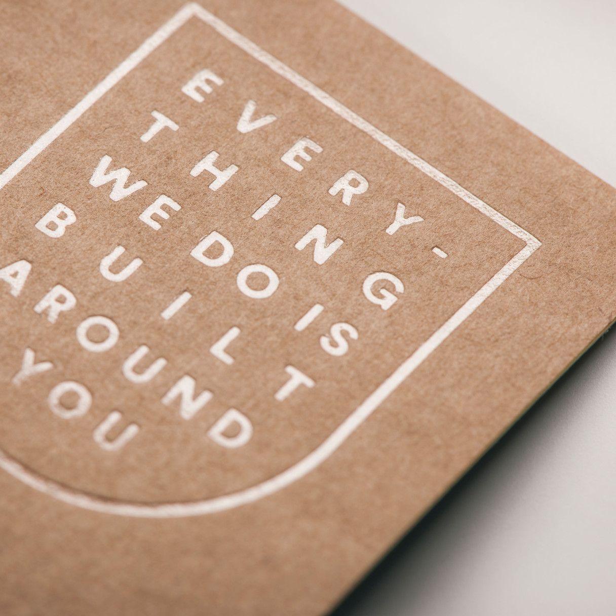
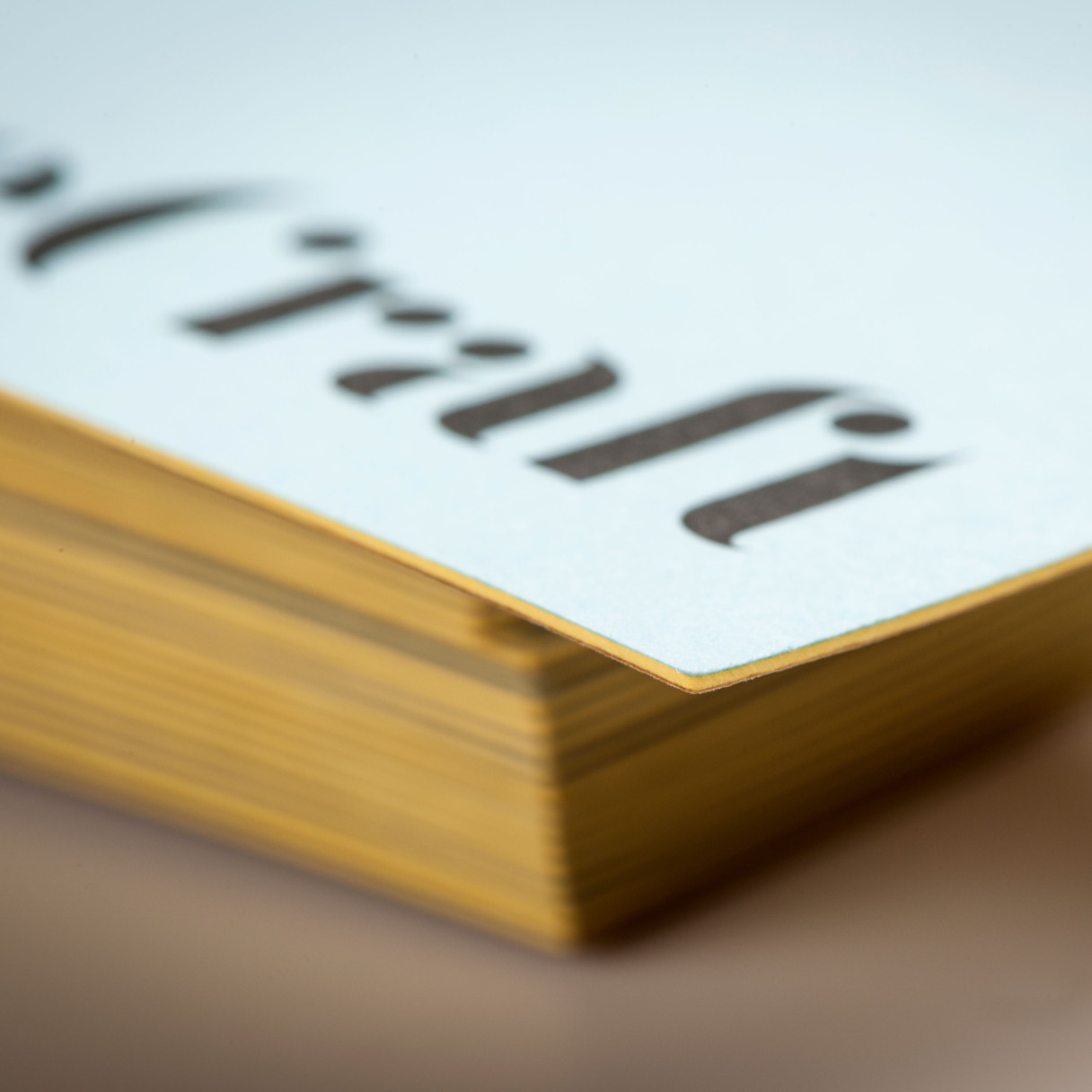
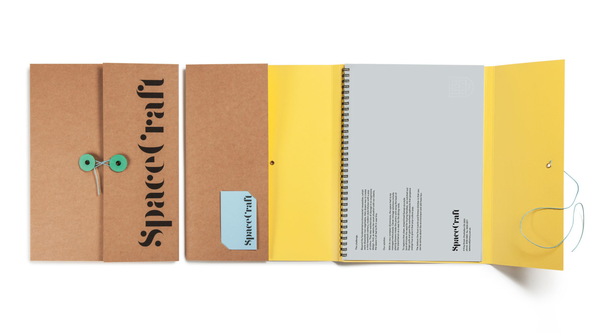
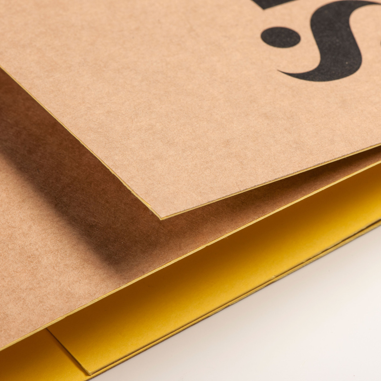
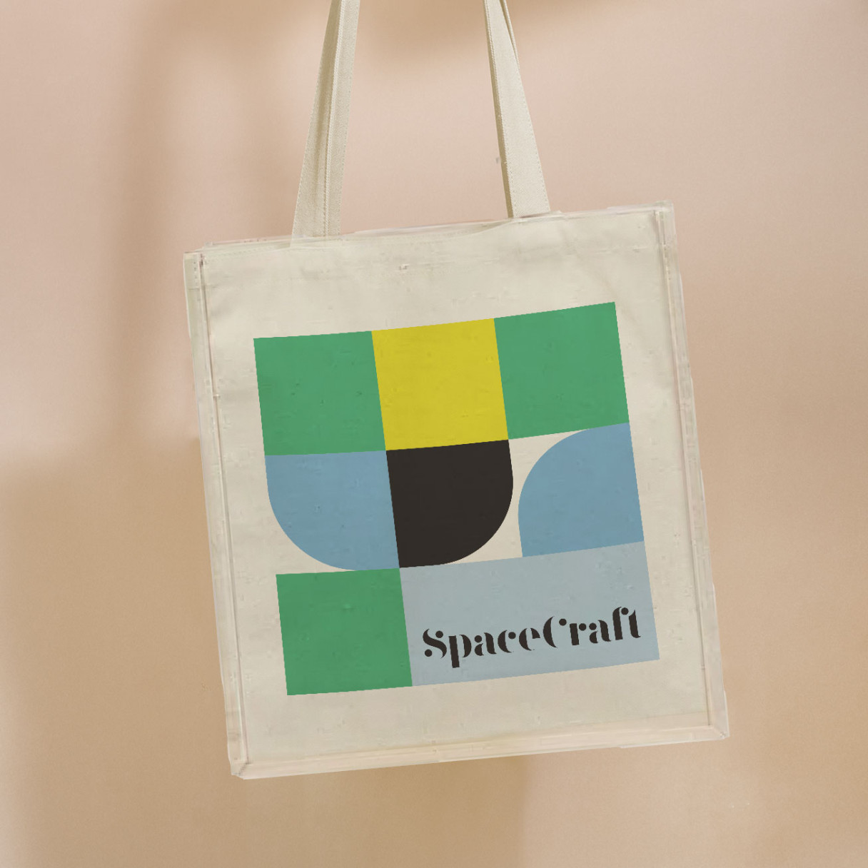
From the very beginning, we have paired textured brown paper stock with vibrant yellow, green and sky blue pops, to give the SpaceCraft brand energy and a unique feel.
This decision has not only stood the test of time but also ensured recallability across all brand touchpoints. Down to the custom button closure presentation folders that their customers love.
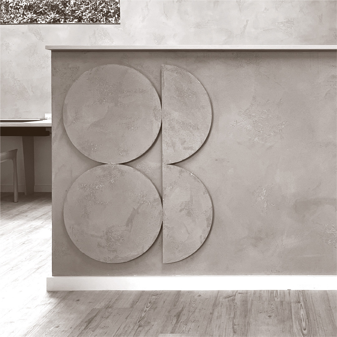
The distinct logotype, brand crest and geometric pattern all work harmoniously with the brand colour palette across vehicles, warehouse signage, uniforms and more.
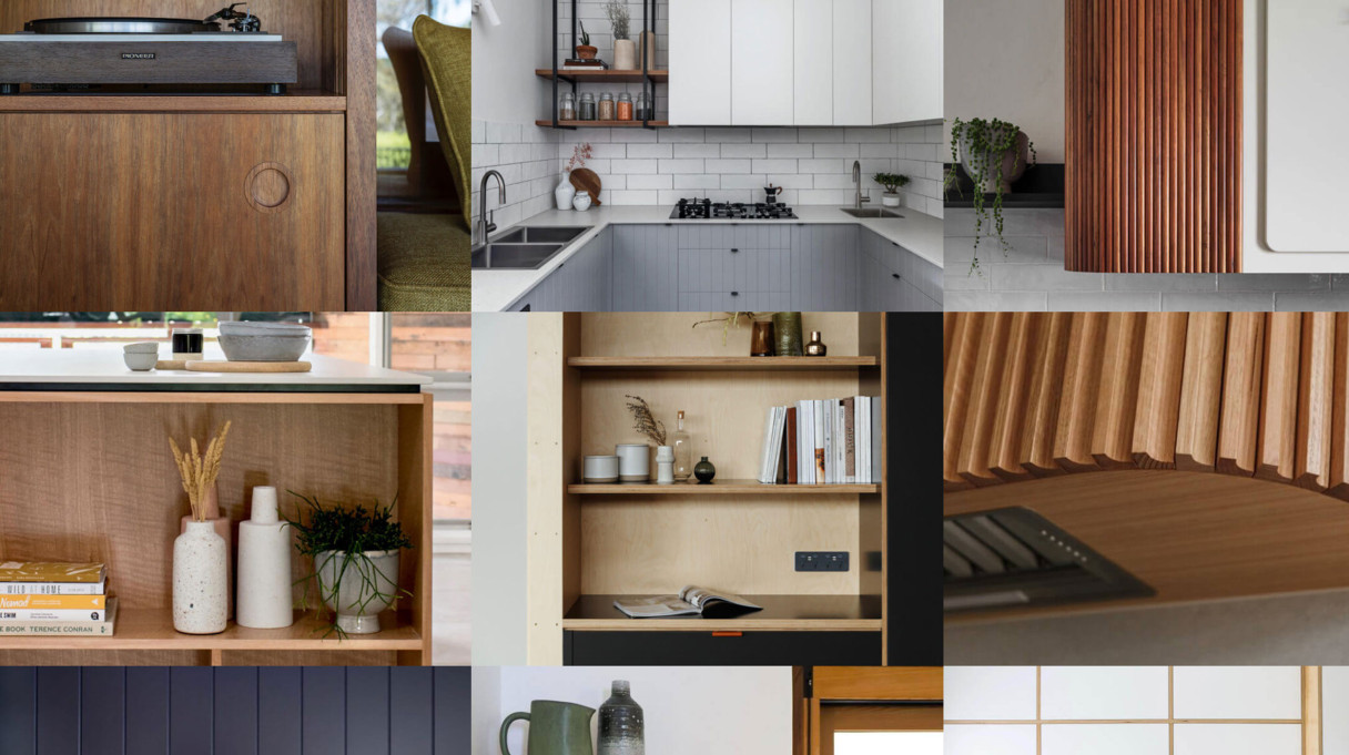
Imagery provides an additional layer of depth in the brand’s tool kit. And, we’ve always ensured that it is carefully planned and executed to be lifestyle centric and inspirational. But most importantly, that it also features real Spacecraft customers in real Spacecraft spaces.
It goes without saying that all print and digital advertising is built around real clients enjoying their SpaceCraft spaces too. Often with kids, pets and/or partners in the frame.