Joto Identity
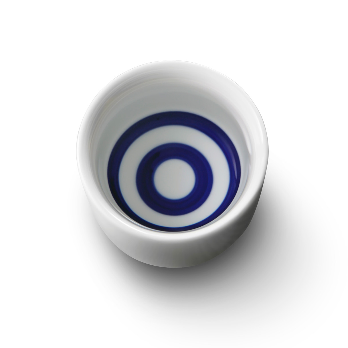
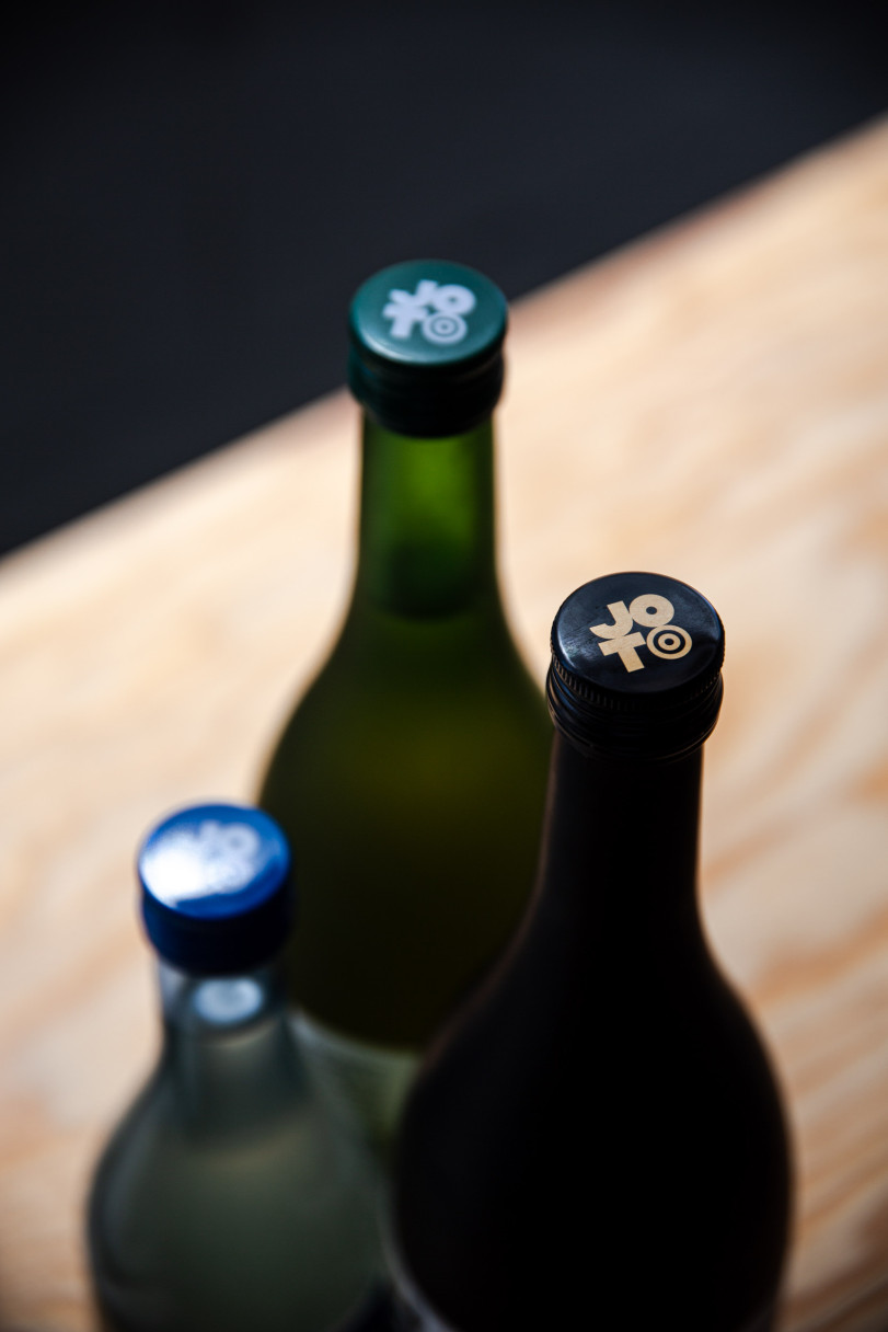
The logo developed for Joto was inspired by the geometrical minimalism of Japanese design, but contains a visual delight for the sake aficionado. Sake is traditionally drunk from a snake’s eye cup—a white porcelain vessel with two blue rings printed on the inside that allows the drinker to judge the sake’s clarity and purity.


