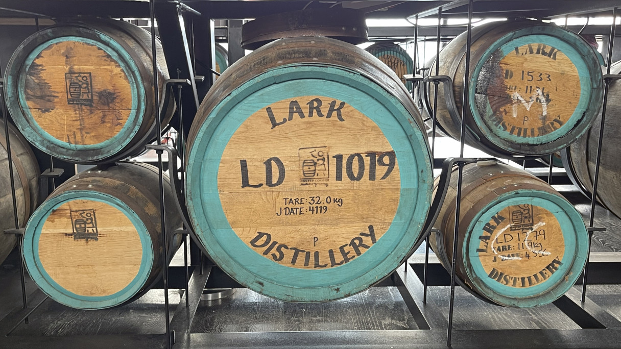
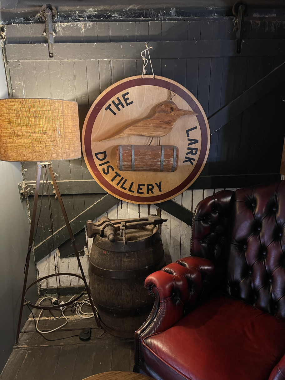
Lark Strategy
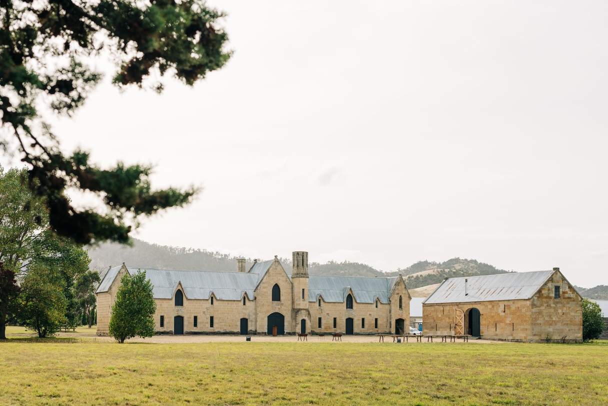
The Australian craft spirits industry can rightly thank Bill Lark for its very existence. It was in the late 80s that Bill first wondered why no one was making whisky in Tasmania—a location perfect for its production. Turning this idea into action, he lobbied successfully to overturn Australia’s antiquated distillation laws and established Australia’s first distillery in 154 years, Lark Distilling Co, in 1992.
When Lark approached us, they were on a decidedly upward trajectory. They had experienced triple-digit growth, established the “Made of Tasmania” positioning, built an extensive Limited Release program, lifted the brand’s luxury credentials and expanded their e-commerce platform.
However, the business’ ambition to build the first global icon of Australian spirits loved by people worldwide also required the evolution of its brand, identity and packaging.
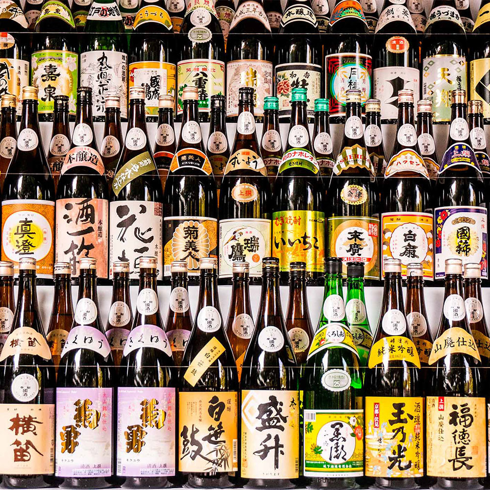
The initial brief described the whisky category as pretty homogenous, with all players using the same tropes (casks on fire, grain, landscape, swirling liquid, etc.) to sell their wares. Whisky was old, white, masculine, dark, exclusive, tradition-constrained, and entirely predictable.
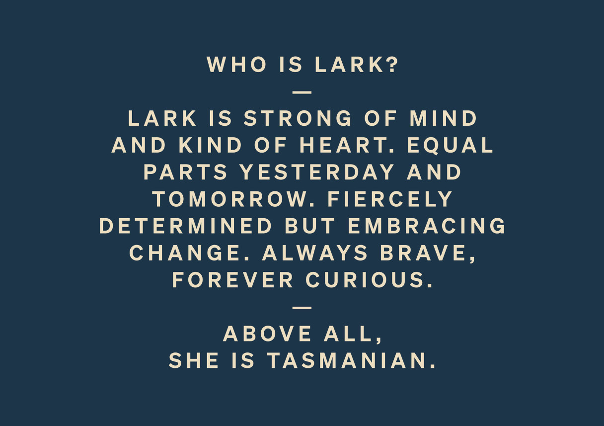
Lark wanted to be unexpected, youthful, diverse, provocative, light, bright, inclusive, unconventional, experimental and explorative. They also needed to capture the next generation of whisky drinkers—the explorers.
Our first task was to define who Lark was (and wanted to be). Following our strategic and investigative process, which included workshops with stakeholders, it was agreed that Lark’s voice should be that of a strong, brave and principled female—a massive departure from the norms in the whisky world.
However, once this position was understood and strategically defined, decisions on tone of voice, livery, collaborations, etc., became far easier to make.