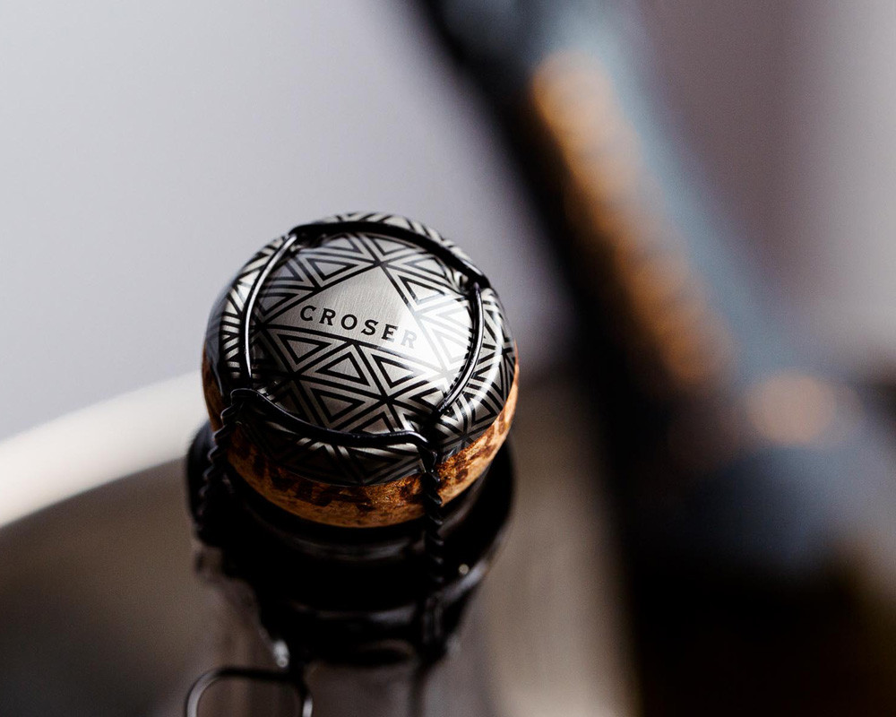
Oxford Landing Packaging
Sustainability has always been at the heart of Oxford Landing. In fact, the business has planted an acre of native bushland for every acre they’ve planted to vine since 2007.
So, we were understandably excited when they came to us in the early 2020s, proclaiming they were ready to evolve their brand story and highlight (not hide) their Riverland home.

Since its launch in the late 1980s, the Oxford Landing brand has gone from strength to strength, becoming one of Australia’s most successful wine exports. At one point, even holding the position of #1 selling Australian Sauvignon Blanc in the UK and singlehandedly increasing demand for the varietal in the UK market.
So, it made sense that the brand story and its visual aesthetic had always sought to appeal to the Brits through ties to rowing and the City of Oxford.
Yet, thirty years after the brand’s inception, the global wine landscape, consumer needs, and Oxford’s sentiment had all shifted seismically.
Out was the need to hide Oxford’s home, the Riverland, for fear consumers might perceive it to be bulk booze. And in was a sense of pride. Pride in being Australian. Pride in being South Australian. And pride in being from the Riverland.
After thoroughly investigating the Riverland, the River Murray and what makes the region so important to Oxford Landing itself, we were well-equipped to instil a new narrative, authenticity and a sense of provenance into the brand.
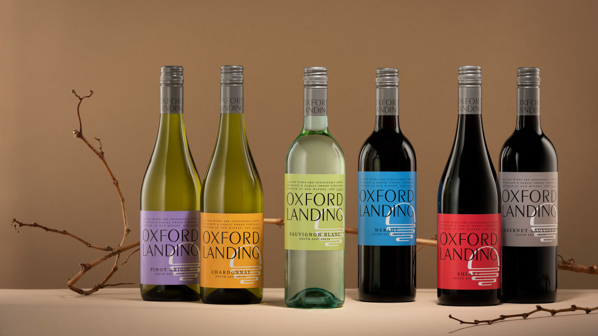
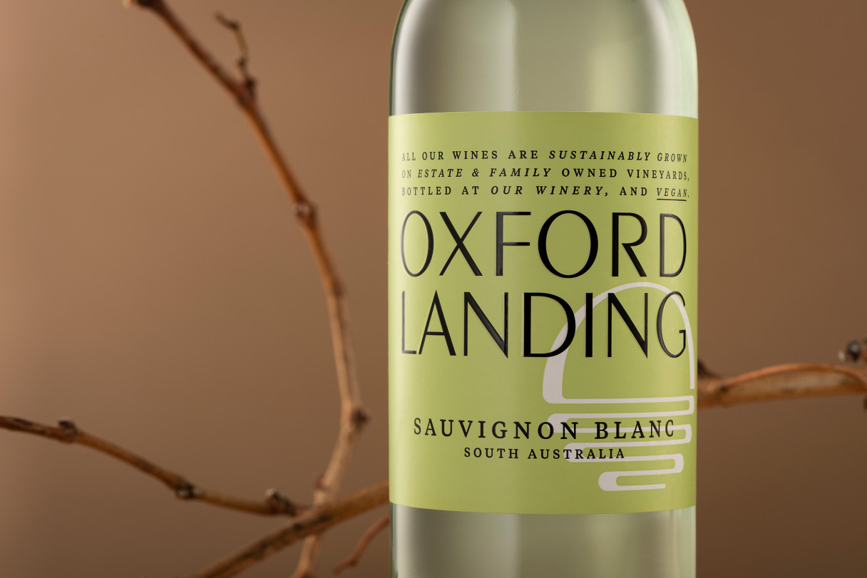
Starting with the identity, we redeveloped the logo to be a clean, proud and strong typographic mark. We then devised a secondary supporting mark. A roundel that depicts the mighty Australian sun reflected over the waters of the Murray River. A mark that may not be identifiable to a UK consumer as the Australian sun over the River Murray but still imparts two life-giving and easily recognisable elements—water and sun.
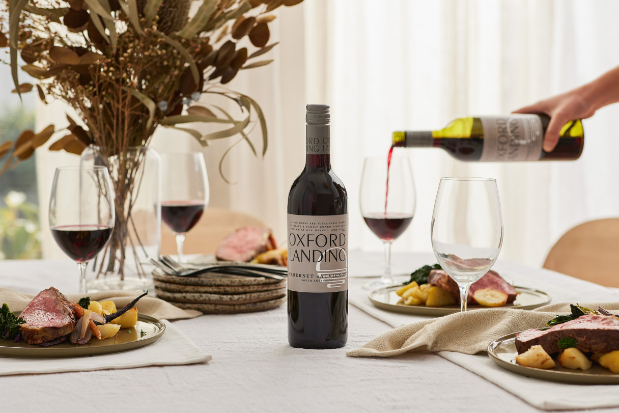
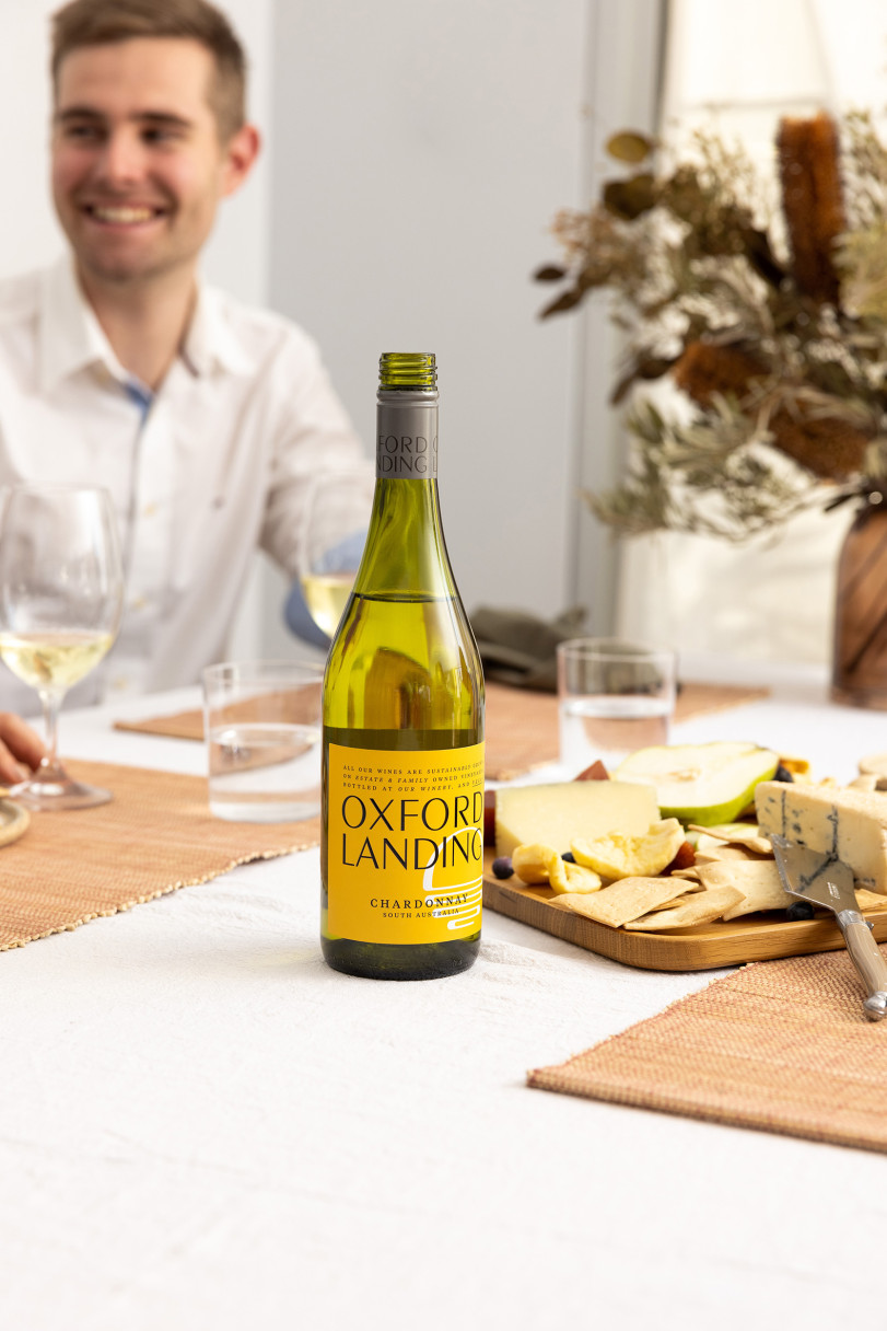
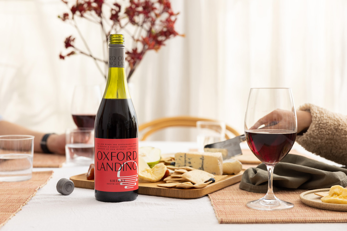
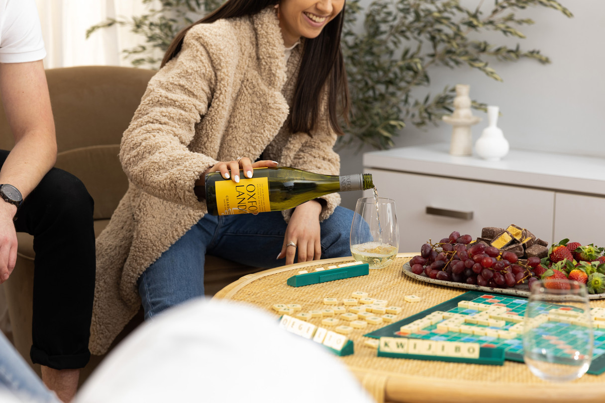
Next up was colour palette. And this was a lot of fun. Drawing reference from the past labels for recallability, we also considered the rich earth of the Australian landscape, the colours cast off the river in changing light and the native flora found bestrewn across the region’s rich red earth.
The final piece of the packaging puzzle was to craft brand messaging and develop written communications aligned with the brand’s evolving visual direction and overarching ethos—one with provenance, people and sustainability at its centre.
The resulting packaging is loud, proud and imbued with a true sense of Aussieness and Riverland pride.