Petaluma Strategy
When we were first approached to work with the team looking after Petaluma and Croser, the first task was to make sense of the relationship between Petaluma and Croser. Petaluma started as a business that had two wine brands—Petaluma and Croser. Petaluma was still seen as a business (employees referred to their employer as Petaluma) and a wine brand (what the business produced). Our brand architecture outlined and defined when and to whom Petaluma spoke as a business and as a brand, and the relationship with its sibling, Croser.
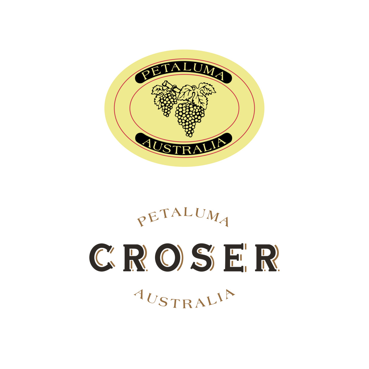
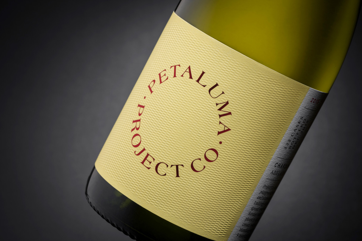
To the left is how we found the identity system. The Petaluma label was being used as the logo for the company, a job it was not designed to do, causing reproduction issues at small scale.
And the Croser wordmark was typographically clumsy, particularly noticeable when used at large sizes. Not a trait suitable for one of Australia’s finest sparkling wines.
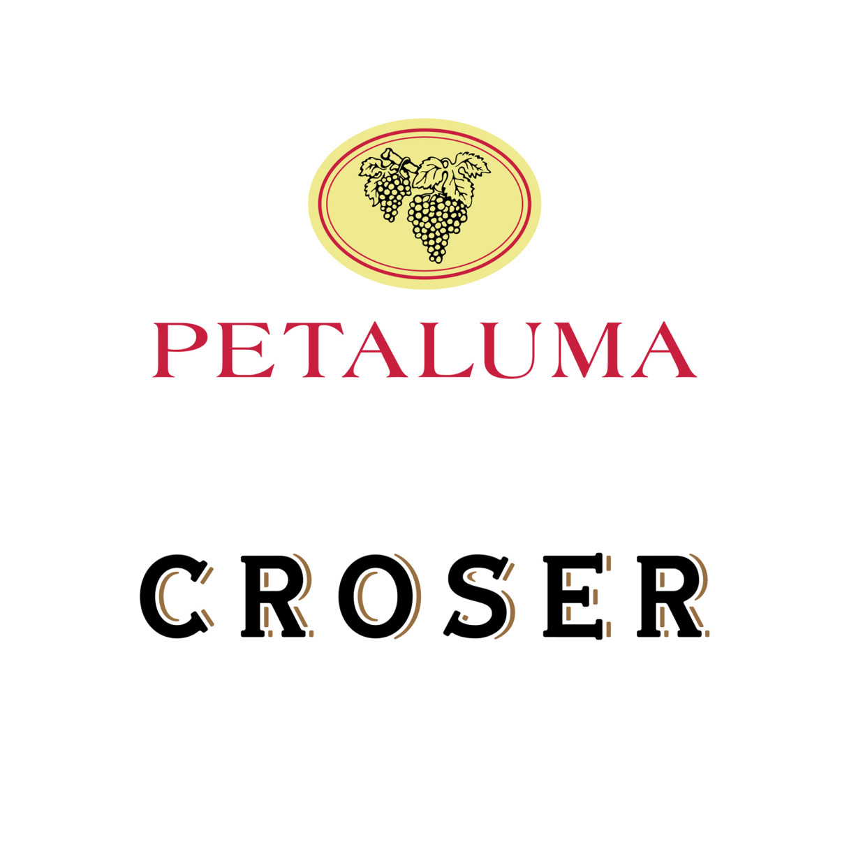
Our solution on the right was to increase the prominence of the Petaluma wordmark by removing it from the lockup, and redrawing the grape motif to aid in reproduction.
The Croser logotype was completely redrawn so it retained its sophistication and elegance at any size and situation.