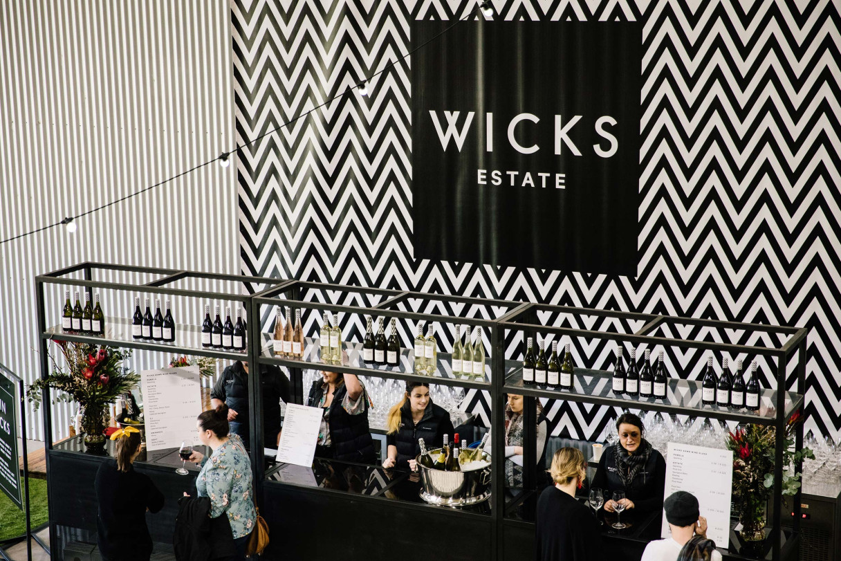
Wicks Estate Identity
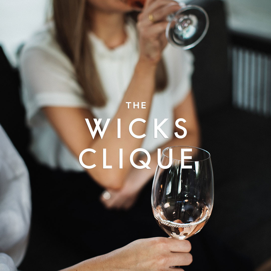
Wicks Estate is the family owned and operated winery located in the Adelaide Hills. Brothers Simon and Tim knew that to take Wicks to the next level and realise its full potential, they needed to look more strategically at their brand. We recommended that they overhaul the brand to appeal to a younger audience, with a female skew.
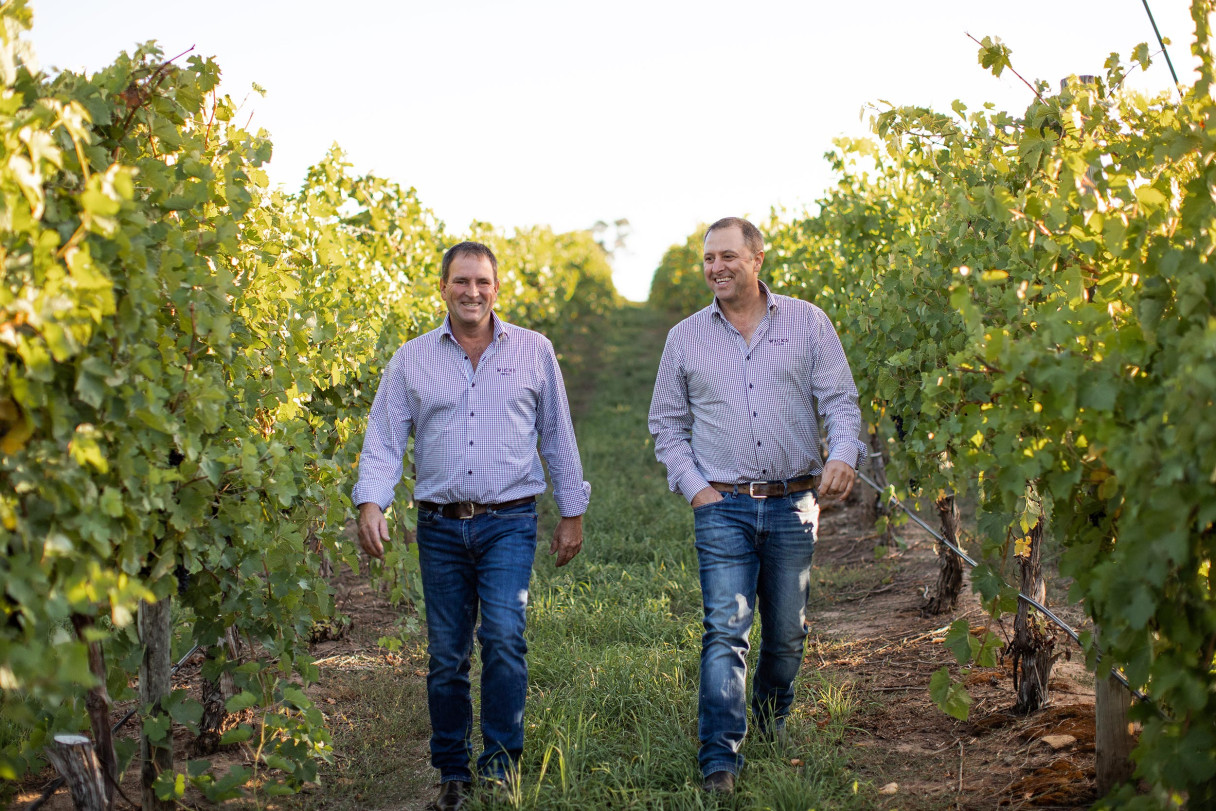
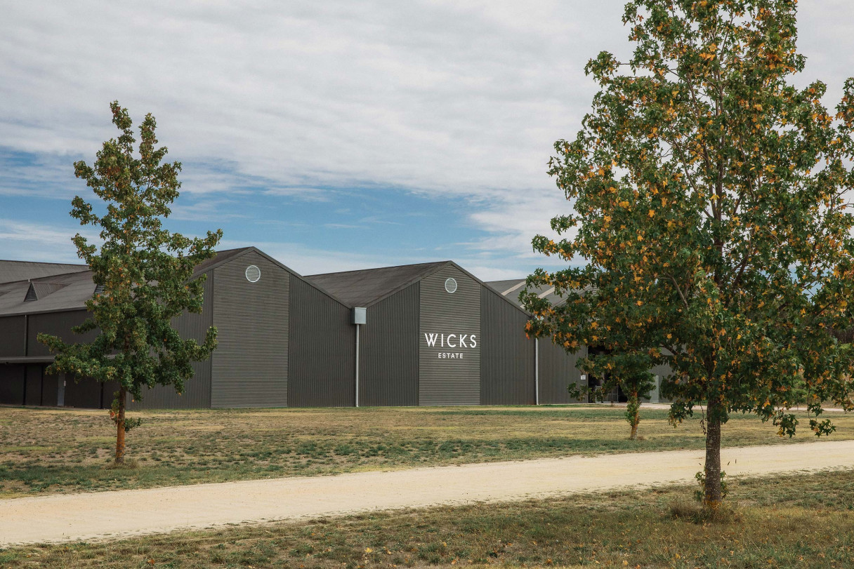
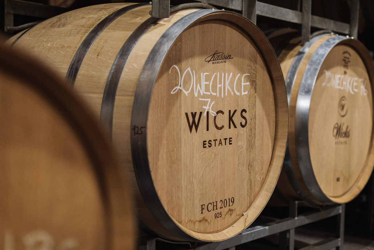
Wicks grow all of their own fruit on their estate vineyards in Woodside. The winery is in the middle of the estate, meaning they have total control over every part of the winemaking process. At no time do their precious grapes leave their hands. This became a central pillar to the new brand narrative.
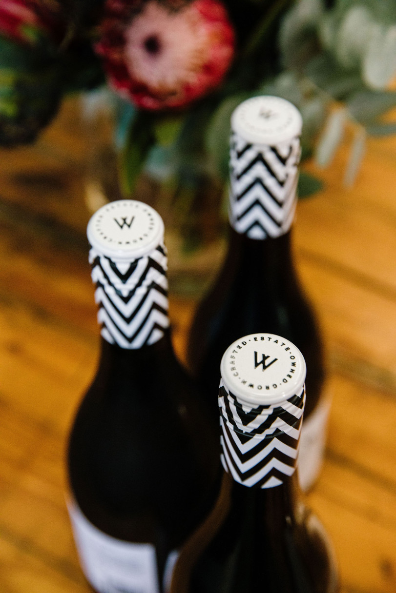
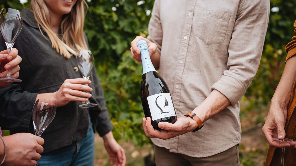
Given Wicks long association with Adelaide Fashion Festival and the fact we wanted to build a more female friendly brand, we drew inspiration from cosmetic and perfume packaging.
The new identity direction presents with minimalist typographic styling, a monochrome colour palette and a repeating W chevron pattern that could be seen a mile away—across a crowded bar or a catwalk.