Orbis Packaging
The Orbis labels speak directly to the business’ ethos and the eternal cycle of renewal present in circular farming.
Featuring the logomark—a mythical custom-illustrated Ouroboros—within a block of colour, the Orbis labels tell the brand’s story whilst commanding attention on shelf.
All secondary information including the varietal and GI are confined to the back label. This not only encourages people to turn to the bottle for important details. It also allows them to discover the brand’s mission statement and sustainable farming credentials.
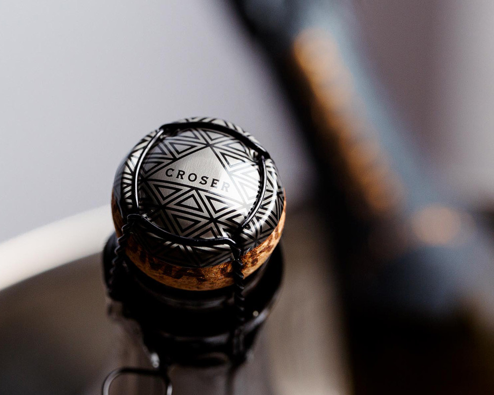
Each bottle is sealed with a naked cork closure, making it easy to recycle and reducing waste by omitting muselets and over-closures altogether.
The cork is embellished with an Ouroboros circling the skirt, providing 360 degrees of visibility and further impressing the brand’s circular message.


Credits
—
Illustration Commission:
Dan Tomkins


